Garth Glazier: The Beautiful Line: Digital Painting: 1971 Buick Riviera 1
I have posted this work for sale om Fine Art America.
<a href='http://fineartamerica.com/featured/1971-buick-riviera-in-maroon-garth-glazier.html' size='20'><img src='http://fineartamerica.com/displayartwork.html?id=11872566&width=250&height=164' alt='Photography Prints' title='Photography Prints' style='border: none;'></a>
Tuesday, May 27, 2014
Garth Glazier: The Beautiful Line: Digital Painting: 1971 Buick Riviera 1
Garth Glazier: The Beautiful Line: Digital Painting: 1971 Buick Riviera 1
I have posted this work for sale om Fine Art America.
<a href='http://fineartamerica.com/featured/1971-buick-riviera-in-maroon-garth-glazier.html' size='20'><img src='http://fineartamerica.com/displayartwork.html?id=11872566&width=250&height=164' alt='Photography Prints' title='Photography Prints' style='border: none;'></a>
Wednesday, April 6, 2011
Illustration Fundamentals: Instructor Garth Glazier: ASSIGNMENT #1: Creating an Illustration of a Building for a Corporate Brochure
car art digital artIllustration Fundamentals: Instructor Garth Glazier: ASSIGNMENT #1: Creating an Illustration of a Building for a Corporate Brochure
Sunday, June 20, 2010
Exercise #14; INKING - Using Black Shapes and Lines to Indicate Form and Light
These two ink illustrations were first drawn in pencil using the techniques we have covered so far. They were both constructed in point perspective. I used major features like windows and moldings to locate the vanishing point. The final step was to apply black shapes to the subjects so that they would look dimensional. Notice hat I selected certain areas to be whiter and other areas to be filled with black. These choices help create a sense of light coming from a particular direction.
On your Car or Robot drawing, try to use black shapes to indicate reflections on metal or glass surfaces. Let your shadows be dramatic with strong blacks. Use lines to indicate details like seams or texture. Also, try to be consistent with your rendering Repeating shapes should be rendered in a similar way and the light source should be consistent.

Heavy black shapes are excellent for indicating glass and sheet metal. Blacks also act as strong graphic shapes to add drama. The shadow edges line up with the vanishing point in perspective. The shadow is also shifted inward to indicate the light source is at an angle to the right of the truck

Wednesday, June 16, 2010
ASSIGNMENT #4: Suspense Novel Cover Illustration
Here is the project brief:
You have been awarded the assignment by the publisher Random House create a black and white toned illustration for a suspense novel. The objective of this assignment is to create a dynamic illustration featuring a celebrity who has become involved in a dramatic story of intrigue and high action drama. The illustration should feature the face of a recognizable celebrity as the main element of the design. The face should be large and dominant and rendered in strong tones of light and shadow. A secondary figure or object should be added to suggest a story element such as a moment of action like an exploding car or gun firing. The title of the story is “NIGHT GAMES,” and should be included as a major element in the design of the illustration.
The illustration dimensions are proportional to 8”x 10.” You will render your illustration larger at 14”x17” on a sheet of good quality toned Artagain paper or a similar brand of paper like “Mi-Tientes Paper or toned Strathmore Paper.”
The Process:
The “NIGHT GAMES” illustration example below shows the level of complexity for this assignment. Your illustration should be rendered to fill an 14” x 17” “crop” area.
Remember to leave extra paper all around the edge of the illustration “live” area. This is a border of extra image that allows for adjusting the crop. You will overlap your illustration into this area and then crop in along the crop marks that indicate the part of the image that would be reproduced in printing. This final crop will used for the final mounting and presentation.
- You can select the celebrity to feature in this assignment. Try a Google search of celebrities to find a good quality image that has strong light and shadow.
- Save the image on your computer or a flash drive and print out a copy to use for drawing.
- Select a typeface to use for the cover title or create your own type using a type face as the basis of your unique letter forms.
- Find reference for the secondary element of a figure, car, weapon, or other object that might suggest a story.
- Render a set of quick thumbnail sketches that incorporate the type elements with the main illustration of the featured celebrity, and the added action element.
- Select your best thumbnail drawing and use it to create a clean full size drawing using your triangle or French curve as needed. This drawing will be submitted for approval to the instructor. Add some tone to indicate light and shadow.
- Create the finished illustration incorporating all three elements of type, portrait, and action element.
- Crop and mount the finished illustration on black matte board and submit for grading.
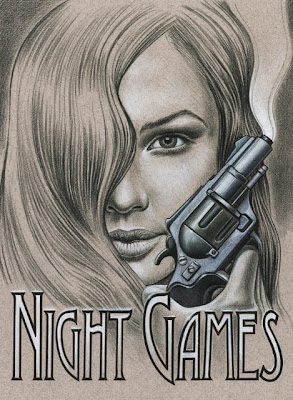
Suspense Novel Cover Illustration, Demonstration
Developing a Working Concept From Reference
In this case I have found an inspiration for a possible book cover idea in a piece of photo reference that I came across in a fashion magazine. I intend to use the sultry expression on the woman’s face as a starting point for a mystery novel. I tried out different phrases until I settled on “Night Games” as my working concept.
While I was working on thumbnail sketches I looked at several different typefaces to see if there were one or two that would work well with the concept. I chose to look at serif typefaces and I zeroed in on anything that had a suggestion of mystery. I then printed out the phrase in each typeface to see how it would look.

Thumbnail Sketches
In these two thumbnail sketches I explored the idea of including a gun as a prop. and the idea of flames rising up in front of the woman’s face. I also have the type “reversing out” as white in the gum sketch and as black in the flames version. This a good example of how I work through ideas before beginning a final “tight” drawing.
Refining your initial Concept and Developing a “Tight” Pencil
As you can see in the “tight” sketch below, I found clear reference for the gun and incorporated this prop into the illustration by rendering a full tone drawing that shows the light source and the position of the gun in the hand. I also indicated the woman’s face and hair with subtle tones to show the light source and to establish the dark mood I wanted in the illustration. The type has been reversed out of the illustration so that I will know exactly how to position this element in the final illustration on Artagain paper.

Finding good reference is essential to creating a great illustration. After an extensive Google search I opted to use the image of the small handgun to the left as the basis for the gun in the illustration.
The tight pencil drawing below shows how I subtly changed the structure and quality of light on the barrel and handle to match the light on the woman’s face.
For the “tight” or finished pencil drawing I used a 2H graphite pencil. I drew the hand freehand so after I determined where the gun should be positioned. I traced a basic outline of the features of the face by backlighting my 360 Graphics Art paper on a light box and then freehanded in all the tones and subtle details including the hair, eyes, lips, and nose by comparing the photo reference to my drawing.

Creating the Finished Illustration: Where to Begin.
Once I have completed a light outline drawing to show me where to add tone I begin the illustration by using black Prismacolor to indicate the dark tons in the face and hair. I start gradually with light pressure on the colored pencil to let the color of the paper show through. I build darker areas of tone like the shadow around the eye by gradually darkening the tone with several layers of black. I also work outward from the darkest point in the shadow toward the edge letting the black color fade off until there is only the tone of the paper. Notice that I follow contours when I start rendering the hair so that I convey the structure properly.

I used a 2H graphite pencil to create the basic outline using light pressure so as to avoid“scoring” the paper so that tone can be applied without exposing dents in the paper surface.I begin adding lighter tones by gradually blending white colored pencil over the toned paper with light pressure starting at the center of the light area and fading the tone the tone outward.
Use crop marks to indicate outer edge of your drawing area instead of outlines.
Rendering Deeper Tones
I develop tone gradually on the toned paper as I render details of the face and hair. I also work “globally” which mean I add similar tones all around the illustration rather than concentrating on one area. This approach allows me to render different areas of the illustration consistently using the same approach and technique. The result is a more organic look to the art as though it was created all at once. Getting fixated on one area can cause you to loose site of the whole look and feel of the illustration by getting to dark too fast or making some areas look overworked. Notice how I keep following the contours of the hair to develop the full range of tones. I have also deepened the shadows around the eye.

To deepen tones I build up layers of colored pencil gradually to indicate the darker areas and I leave the lighter areas clear for mid-tones.
Fine details on the lips like highlights have to be planned in advance by leaving the paper exposed. White colored pencil cannot be applied well over layers of dark color.
Giving the Illustration a Focal Point
As I build tones my goal is to focus the eye on certain areas. In this case the gun and the woman’s face are the areas that I want to highlight so I have concentrated the most intense rendering on these features. I increase the contrast by building up the light tones with layers of white pencil and darken the deeper tones using a combination of grey marker and black Prismacolor pencil. The gun, for example was created by shading in the
tones in colored pencil and then adding a layer of cool grey marker on top, before adding a final layer of colored pencil. The gun looks “cool” in tone because of the use of cool grey marker and gives the illustration a full color look.

Remember to render with bleed beyond the edge of your illustration so you can crop in for the final presentation.
Creating different surface textures like metal can be accomplished by layering the colored pencil and “burnishing” the tones. Burnishing refers to building extra layers of colored pencil up until the wax base begins to make the pigment look smooth on the paper. You can use this smoothness to replicate the hard shiny surface of metal or the glossy gleam of an eye.
The outside border of the lettering is inked with pen and then white colored pencil was added to the inside of each character as a gradation from top to bottom allowing the paper to show through.
ASSIGNMENT #3: “Stylized” Music CD Illustration
Here is the project brief:
You will develop a stylized graphic illustration that will be used for the cover and foldout of an album CD. The illustration must be “Decorative” in interpretation meaning stylized elements will be a major aspect of the design. You will choose the music artist or group as the subject. The name of the artist, group, or music album should be a must be designed as part of the illustration.
A layout will provided with crop lines and type areas that you will have to incorporate into your illustration. This illustration will include color as a flat or patterned element. The primary media will be markers, but paint can be used to create the color element.
A copy of each illustration will be made and folded into a working mockup of a CD package. The original art and the assembled CD cover will be mounted separately on black matte board and turned in as a two part final presentation.

ASSIGNMENT #2: Dream Home Illustration
Here is the project brief:
You have been awarded the assignment to render an exterior view of a dream home or an interior view of an idealized loft studio apartment in line and tone using ink on drawing paper. The objective of this assignment is to create a dynamic perspective illustration of your dream home. Treat this illustration as an opportunity to explore architectural details that you would like to include in a home. If you choose the loft apartment idea, consider all the important elements you would like to include and how they would appear in one/two point perspective. If you chose to render an exterior view of a dream house, consider the style of architecture and the features that you want and how they would appear in one/two point perspective. There is no type element.
The illustration dimensions are proportional to 14”x 10 and you can render the art at this size. This will be a horizontal format. The art can be rendered on drawing paper or illustration board. Use illustration board if you are going to include watercolor washes.
The Process:
- Start by searching for images homes or interior spaces that you find interesting and inspiring. Try a Google search of interior design sites or sites that feature exterior homes.
- Save images on your computer or a flash drive and print out a copies to use as reference for drawing.
- Render a set of quick thumbnail sketches in perspective that incorporate the elements you find desirable in the reference images.
- Create an original drawing in one or two point perspective using your triangle or French curve as needed. This drawing will be submitted for approval to the instructor.
- Create a rendering on illustration board or paper based on the approved drawing.
- Crop and mount the finished illustration on black matte board and submit for grading.
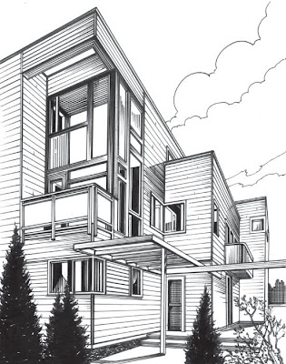
This finished illustration is an example of the level of detail that should be included in the rendering.
Assignment 2: Demonstration
Ink Drawing Assignment - Initial Drawing in One Point Perspective
The first step in any illustration assignment is to create an accurate drawing of the subject before rendering the art. In the case of an ink drawing where some precision is required, take extra time to indicate details accurately. This house is illustrated in one point perspective and was not substantially altered from the reference.
For your illustration you want to create a dream house or interior loft environment from scratch, using reference of elements that you want to incorporate into the illustration.
When you begin to conceptualize the scene, start by identifying the vanishing point for the subject before drawing the structure. In the sketch on the next page, the top edges of the house and the foundation are marked in blue to locate the vanishing point. The second vanishing point for the left side of the house exists in space but is not shown. In this case I followed the reference closely and did not feel that I needed to extend the lines out to the left vanishing point.
Several points to note on the illustration below include:
1. Crops are important for indicting where you intend to end the art. I always create them before I begin drawing the subject. I will “bleed” the lines beyond these edges as I render the art.
2. Repeated parallel lines for shading gave me an idea of how I might create tones in certain areas.
3. All details on the house were made to conform to the vanishing point including the siding which I have begun to indicate in the drawing. I will finish this detail work in the final illustration.
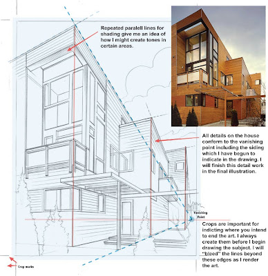
There are several more points to note on the drawing pictured above:
- Crops are important for indicting where you intend to end the art. I always create them before I begin drawing the subject. I will “bleed” the lines beyond these edges as I render the art.
- Repeated parallel lines for shading give me an idea of how I might create tones in certain areas.
- All details on the house conform to the vanishing point including the siding which I have begun to indicate in the drawing. I will finish this detail work in the final illustration.
Ink Drawing Assignment – Beginning to Render the House
Once the pencil drawing was complete it was time to begin inking in the major details of the building. I inked the edges of the building and the major shapes like window frames. I added solid black areas in the windows to indicate reflections and dark tones on the bushes using a Sharpie.

Make sure your inked lines stay on track with the pencil drawing that is your guide. Be careful not to smear the ink from your pen by dragging your triangle across the paper. With large black areas I outline the shape with a black line before filling with tone.
There are several more points to note on the drawing pictured above:
- Use your triangle or the straight edge of your T-square as much as possible to create straight edges in your ink drawing.
- Locate major dark shapes in the subject and fill with black using a Sharpie.
- You can use cross hatching to create mid-tones.
Ink Drawing Assignment – Finishing the Illustration
The last stage of the process involves adding details and tones. You can see in the transformation from the partially completed inking to the final illustration how I cropped into the image to clean up the edges by eliminating the “bleed”. I also added a lot of shading by using parallel lines. These areas always fall on the shadow side of the house which faces toward us or in areas where the corners of the house cast shadows across the siding. I added cross-hatching to the front doorway and more dark areas in the windows.

Think about adding a variety of textures to limited areas of the illustration. The trees can have an indication of leaves and the evergreens are a good place to create a deep textured pattern instead of simply filling with a solid black.
There are several more points to note on the rendering above:
- Use your triangle or the straight edge of your T-square as much as possible to create straight edges in your ink drawing.
- Locate major dark shapes in the subject and fill with black using a Sharpie.
- You can use cross hatching to create mid-tones.
Watercolor or Acrylic Washes:
If you are thinking of adding watercolor washes to the image, there are two approaches that can be taken.
1. Think about adding thin washes of tone to limited areas before and during the inking process. Remember to test the ink pens you have selected to make sure the lines won’t bleed when a wash is added.
2. Think about adding a thin coat of clear acrylic matte varnish over the line rendering first. This coat will seal the art and allow you to experiment with adding light watercolor washes without destroying the line art.
A demonstration will given on how to apply washes.
ASSIGNMENT #1: Creating an Illustration of a Building for a Corporate Brochure
Here is the project brief:
You have been awarded the assignment to render a building in black and white using ink (marker pen) on drawing paper. The objective of this assignment is to create an appealing illustration for a corporate brochure that can be printed in one color. Treat this illustration as a unified graphic design by incorporating a type element. The type element can be the name of the company or the corporate headquarters. In other words, the illustration should function as a signature element like a logo design that is distinctive and easily recognizable. The illustration dimensions are proportional to 4”x 5.” You will render your illustration larger at 8”x10 on a sheet of good quality drawing paper.”
The Process:
- You can select the company building to feature in this assignment. Try a Google search of corporate headquarters to find a good quality image.
- Save the image on your computer or a flash drive and print out a copy to use for drawing.
- Locate, save, and print out a copy of the company name or logo to use in the illustration.
- Render a set of quick thumbnail sketches that incorporate the type elements with the building illustration.
- Create a clean drawing using your triangle or French curve as needed. This drawing will be submitted for approval to the instructor.
- Create an inked rendering incorporating the company name with the illustration of the architectural elements.
- Crop and mount the finished illustration on black matte board and submit for grading.
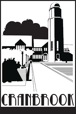
The “Cranbrook” illustration example to the left shows the level of complexity for this assignment. Your illustration should be rendered to fill an 8” x 10” “crop” area. A crop is the term used to describe the printable area for a graphic, photo, or illustration element.
A client or art director will usually give you specific information regarding cropping and image size. They will also specify whether the art will be reproduced as one, two, or full color. This information determines how you will create and prepare the illustration. In this case, we are creating artwork that will be printed in one color on a variety of materials, so you will want to make sure that edges are clean, and shapes are distinctive.
DEMONSTRATION: Cranbrook Rendered
As you select reference for this assignment, look for photos with strong shadows and good contrast. This will help in interpreting the photo as a series of positive and negative areas. Below, I have outlined an example of how to translate an image into an inked illustration.

If you are having difficulty determining how to determining what areas should be black and what should be white, it helps to squint your eyes and see only the dark masses and white or negative areas in a scene. The light source comes from left to right in the scene below creating dark areas on all the right facing sides of the building and the lights. Shadows are also cast to the right. The three versions of the image below show the reduction of a color photo to simple black and white shapes. The interpretation of the shapes is guided by the play of light and shadow as well as by perspective. The dotted lines show how I interpreted the vanishing point and the blocked in areas demonstrate my interpretation of the shadows.

You also may want to print out a grayscale version of your reference by setting your printer to black and white. If you have access to an image editing program like Photoshop Elements, it might help to adjust the contrast as I did on the image below right. This can give you a head start in interpreting the positive and negative areas in the composition.
Creating a Dropout Image:
If you need to, you can alter a scanned or digital photo so that it prints out as a high contrast black and white image. By further pumping up the contrast in this photo I created a version of the image that separated the dark and light areas to the point where almost all of the middle tones are gone. The side by side images below show how I then simplified these dark areas into graphic shapes.

You can use repeating lines and crosshatching to convey mid-tones as I did for the grass and the stone blocks under the lights. Very dark areas were simplified into solid black shapes.
TIP: In several parts of the illustration a triangle is required for making clean straight edges. Run the tip of an ink pen along the straight edge of the triangle from one corner to another. I used this technique to create the repeating lines that simulate a tone.
Adding Type and Completing the Design
Following the thumbnail sketch on which I based this illustration, I did a search of type faces until I found several that seemed to match the character of the illustration. You can use the word processor on your computer as a starting point, but I would recommend searching the free fonts sites on the web. You can also design your own type face, but be sure to show me some sketches on this for approval.
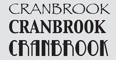
I found three fonts that I liked best. They are pictured below. To try out each font, I printed the type at a size that fit within the design sketch and did a tracing as part of the pencil drawing. I chose the font called Betty Noir.
Finalizing the Design
The last stage of the process is to bring the illustration of the building together with the type. Creating two versions, I experimented with adding or subtracting borders in the thumbnail stage. Ultimately, I chose to unify the design with a border as shown in the version shown above.
I included an alternate below without the border. Clients will often ask for alternate versions that can be used in a variety of situations. Either illustration represents a successful design. Once your inked illustration is complete you will be asked to mount the image on black matte board for final presentation.

The following link will give you a selection of corporate centers to choose from: http://www.golubandcompany.com/pages/view_all_properties/90.php
Subscribe to:
Posts (Atom)