Here is the project brief:
You have been awarded the assignment by the publisher Random House create a black and white toned illustration for a suspense novel. The objective of this assignment is to create a dynamic illustration featuring a celebrity who has become involved in a dramatic story of intrigue and high action drama. The illustration should feature the face of a recognizable celebrity as the main element of the design. The face should be large and dominant and rendered in strong tones of light and shadow. A secondary figure or object should be added to suggest a story element such as a moment of action like an exploding car or gun firing. The title of the story is “NIGHT GAMES,” and should be included as a major element in the design of the illustration.
The illustration dimensions are proportional to 8”x 10.” You will render your illustration larger at 14”x17” on a sheet of good quality toned Artagain paper or a similar brand of paper like “Mi-Tientes Paper or toned Strathmore Paper.”
The Process:
The “NIGHT GAMES” illustration example below shows the level of complexity for this assignment. Your illustration should be rendered to fill an 14” x 17” “crop” area.
Remember to leave extra paper all around the edge of the illustration “live” area. This is a border of extra image that allows for adjusting the crop. You will overlap your illustration into this area and then crop in along the crop marks that indicate the part of the image that would be reproduced in printing. This final crop will used for the final mounting and presentation.
- You can select the celebrity to feature in this assignment. Try a Google search of celebrities to find a good quality image that has strong light and shadow.
- Save the image on your computer or a flash drive and print out a copy to use for drawing.
- Select a typeface to use for the cover title or create your own type using a type face as the basis of your unique letter forms.
- Find reference for the secondary element of a figure, car, weapon, or other object that might suggest a story.
- Render a set of quick thumbnail sketches that incorporate the type elements with the main illustration of the featured celebrity, and the added action element.
- Select your best thumbnail drawing and use it to create a clean full size drawing using your triangle or French curve as needed. This drawing will be submitted for approval to the instructor. Add some tone to indicate light and shadow.
- Create the finished illustration incorporating all three elements of type, portrait, and action element.
- Crop and mount the finished illustration on black matte board and submit for grading.
Suspense Novel Cover Illustration, Demonstration
Developing a Working Concept From Reference
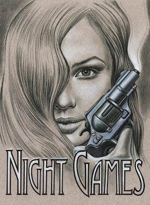
In this case I have found an inspiration for a possible book cover idea in a piece of photo reference that I came across in a fashion magazine. I intend to use the sultry expression on the woman’s face as a starting point for a mystery novel. I tried out different phrases until I settled on “Night Games” as my working concept.
While I was working on thumbnail sketches I looked at several different typefaces to see if there were one or two that would work well with the concept. I chose to look at serif typefaces and I zeroed in on anything that had a suggestion of mystery. I then printed out the phrase in each typeface to see how it would look.

Thumbnail Sketches
In these two thumbnail sketches I explored the idea of including a gun as a prop. and the idea of flames rising up in front of the woman’s face. I also have the type “reversing out” as white in the gum sketch and as black in the flames version. This a good example of how I work through ideas before beginning a final “tight” drawing.
Refining your initial Concept and Developing a “Tight” Pencil
As you can see in the “tight” sketch below, I found clear reference for the gun and incorporated this prop into the illustration by rendering a full tone drawing that shows the light source and the position of the gun in the hand. I also indicated the woman’s face and hair with subtle tones to show the light source and to establish the dark mood I wanted in the illustration. The type has been reversed out of the illustration so that I will know exactly how to position this element in the final illustration on Artagain paper.

Finding good reference is essential to creating a great illustration. After an extensive Google search I opted to use the image of the small handgun to the left as the basis for the gun in the illustration.
The tight pencil drawing below shows how I subtly changed the structure and quality of light on the barrel and handle to match the light on the woman’s face.
For the “tight” or finished pencil drawing I used a 2H graphite pencil. I drew the hand freehand so after I determined where the gun should be positioned. I traced a basic outline of the features of the face by backlighting my 360 Graphics Art paper on a light box and then freehanded in all the tones and subtle details including the hair, eyes, lips, and nose by comparing the photo reference to my drawing.

Creating the Finished Illustration: Where to Begin.
Once I have completed a light outline drawing to show me where to add tone I begin the illustration by using black Prismacolor to indicate the dark tons in the face and hair. I start gradually with light pressure on the colored pencil to let the color of the paper show through. I build darker areas of tone like the shadow around the eye by gradually darkening the tone with several layers of black. I also work outward from the darkest point in the shadow toward the edge letting the black color fade off until there is only the tone of the paper. Notice that I follow contours when I start rendering the hair so that I convey the structure properly.

I used a 2H graphite pencil to create the basic outline using light pressure so as to avoid“scoring” the paper so that tone can be applied without exposing dents in the paper surface.I begin adding lighter tones by gradually blending white colored pencil over the toned paper with light pressure starting at the center of the light area and fading the tone the tone outward.
Use crop marks to indicate outer edge of your drawing area instead of outlines.
Rendering Deeper Tones
I develop tone gradually on the toned paper as I render details of the face and hair. I also work “globally” which mean I add similar tones all around the illustration rather than concentrating on one area. This approach allows me to render different areas of the illustration consistently using the same approach and technique. The result is a more organic look to the art as though it was created all at once. Getting fixated on one area can cause you to loose site of the whole look and feel of the illustration by getting to dark too fast or making some areas look overworked. Notice how I keep following the contours of the hair to develop the full range of tones. I have also deepened the shadows around the eye.

To deepen tones I build up layers of colored pencil gradually to indicate the darker areas and I leave the lighter areas clear for mid-tones.
Fine details on the lips like highlights have to be planned in advance by leaving the paper exposed. White colored pencil cannot be applied well over layers of dark color.
Giving the Illustration a Focal Point
As I build tones my goal is to focus the eye on certain areas. In this case the gun and the woman’s face are the areas that I want to highlight so I have concentrated the most intense rendering on these features. I increase the contrast by building up the light tones with layers of white pencil and darken the deeper tones using a combination of grey marker and black Prismacolor pencil. The gun, for example was created by shading in the
tones in colored pencil and then adding a layer of cool grey marker on top, before adding a final layer of colored pencil. The gun looks “cool” in tone because of the use of cool grey marker and gives the illustration a full color look.

Remember to render with bleed beyond the edge of your illustration so you can crop in for the final presentation.
Creating different surface textures like metal can be accomplished by layering the colored pencil and “burnishing” the tones. Burnishing refers to building extra layers of colored pencil up until the wax base begins to make the pigment look smooth on the paper. You can use this smoothness to replicate the hard shiny surface of metal or the glossy gleam of an eye.
The outside border of the lettering is inked with pen and then white colored pencil was added to the inside of each character as a gradation from top to bottom allowing the paper to show through.
No comments:
Post a Comment