Here is the project brief:
You have been awarded the assignment to render a building in black and white using ink (marker pen) on drawing paper. The objective of this assignment is to create an appealing illustration for a corporate brochure that can be printed in one color. Treat this illustration as a unified graphic design by incorporating a type element. The type element can be the name of the company or the corporate headquarters. In other words, the illustration should function as a signature element like a logo design that is distinctive and easily recognizable. The illustration dimensions are proportional to 4”x 5.” You will render your illustration larger at 8”x10 on a sheet of good quality drawing paper.”
The Process:
- You can select the company building to feature in this assignment. Try a Google search of corporate headquarters to find a good quality image.
- Save the image on your computer or a flash drive and print out a copy to use for drawing.
- Locate, save, and print out a copy of the company name or logo to use in the illustration.
- Render a set of quick thumbnail sketches that incorporate the type elements with the building illustration.
- Create a clean drawing using your triangle or French curve as needed. This drawing will be submitted for approval to the instructor.
- Create an inked rendering incorporating the company name with the illustration of the architectural elements.
- Crop and mount the finished illustration on black matte board and submit for grading.
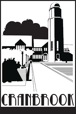
The “Cranbrook” illustration example to the left shows the level of complexity for this assignment. Your illustration should be rendered to fill an 8” x 10” “crop” area. A crop is the term used to describe the printable area for a graphic, photo, or illustration element.
A client or art director will usually give you specific information regarding cropping and image size. They will also specify whether the art will be reproduced as one, two, or full color. This information determines how you will create and prepare the illustration. In this case, we are creating artwork that will be printed in one color on a variety of materials, so you will want to make sure that edges are clean, and shapes are distinctive.
DEMONSTRATION: Cranbrook Rendered
As you select reference for this assignment, look for photos with strong shadows and good contrast. This will help in interpreting the photo as a series of positive and negative areas. Below, I have outlined an example of how to translate an image into an inked illustration.

If you are having difficulty determining how to determining what areas should be black and what should be white, it helps to squint your eyes and see only the dark masses and white or negative areas in a scene. The light source comes from left to right in the scene below creating dark areas on all the right facing sides of the building and the lights. Shadows are also cast to the right. The three versions of the image below show the reduction of a color photo to simple black and white shapes. The interpretation of the shapes is guided by the play of light and shadow as well as by perspective. The dotted lines show how I interpreted the vanishing point and the blocked in areas demonstrate my interpretation of the shadows.

You also may want to print out a grayscale version of your reference by setting your printer to black and white. If you have access to an image editing program like Photoshop Elements, it might help to adjust the contrast as I did on the image below right. This can give you a head start in interpreting the positive and negative areas in the composition.
Creating a Dropout Image:
If you need to, you can alter a scanned or digital photo so that it prints out as a high contrast black and white image. By further pumping up the contrast in this photo I created a version of the image that separated the dark and light areas to the point where almost all of the middle tones are gone. The side by side images below show how I then simplified these dark areas into graphic shapes.

You can use repeating lines and crosshatching to convey mid-tones as I did for the grass and the stone blocks under the lights. Very dark areas were simplified into solid black shapes.
TIP: In several parts of the illustration a triangle is required for making clean straight edges. Run the tip of an ink pen along the straight edge of the triangle from one corner to another. I used this technique to create the repeating lines that simulate a tone.
Adding Type and Completing the Design
Following the thumbnail sketch on which I based this illustration, I did a search of type faces until I found several that seemed to match the character of the illustration. You can use the word processor on your computer as a starting point, but I would recommend searching the free fonts sites on the web. You can also design your own type face, but be sure to show me some sketches on this for approval.
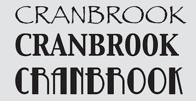
I found three fonts that I liked best. They are pictured below. To try out each font, I printed the type at a size that fit within the design sketch and did a tracing as part of the pencil drawing. I chose the font called Betty Noir.
Finalizing the Design
The last stage of the process is to bring the illustration of the building together with the type. Creating two versions, I experimented with adding or subtracting borders in the thumbnail stage. Ultimately, I chose to unify the design with a border as shown in the version shown above.
I included an alternate below without the border. Clients will often ask for alternate versions that can be used in a variety of situations. Either illustration represents a successful design. Once your inked illustration is complete you will be asked to mount the image on black matte board for final presentation.

The following link will give you a selection of corporate centers to choose from: http://www.golubandcompany.com/pages/view_all_properties/90.php
No comments:
Post a Comment